MAISON BORDEAUX
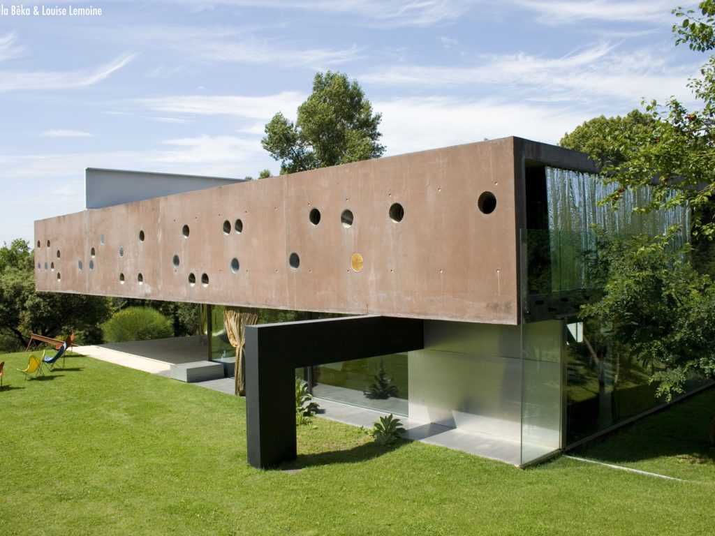
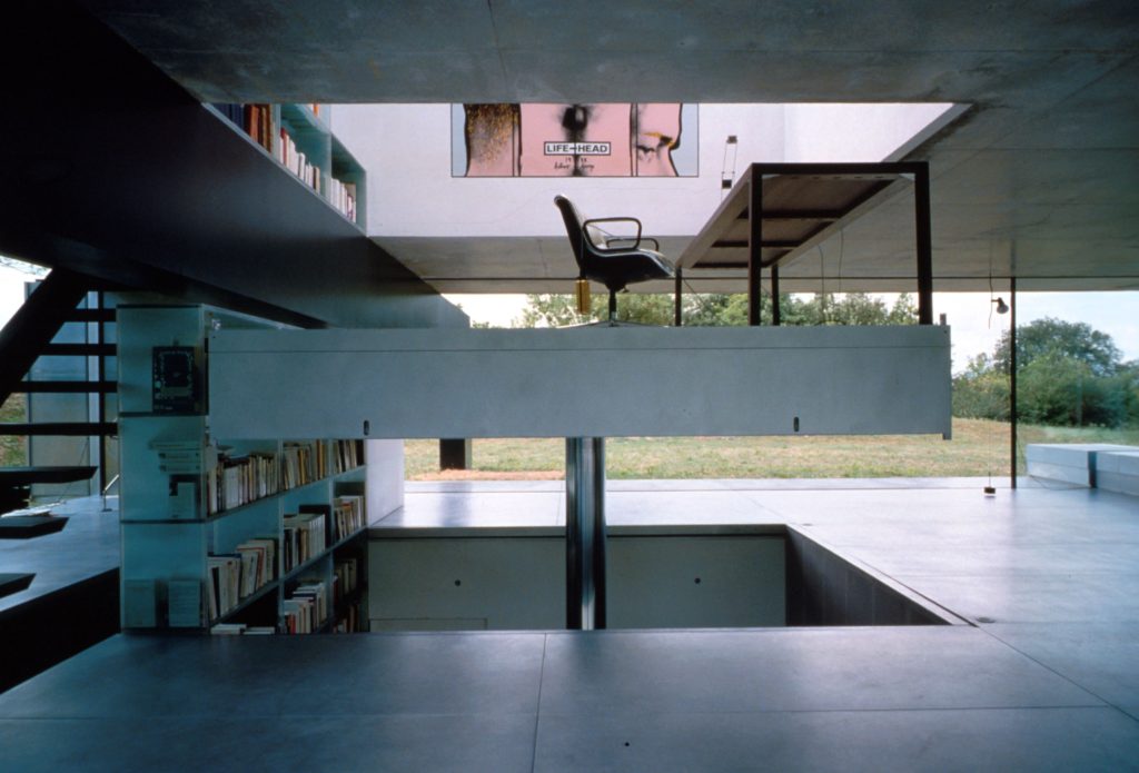
For Maison Bordeaux what I thought was the most interesting was how looking from the outside the house has almost a brutalist look with it being made of concrete and having online very basic shaped on its composition. However, the inside of the house is actually very modern, with use of glass and wood. That’s where I believe that there’s a collision of ideas.
I watched the housekeeper interview and it gave me a completely different feel of the house from what I got by seeing the pictures, allowing me to understand the reason to some of Kool Haus’s decisions and how those are crucial. That made me see how the collision of ideas actually compliments each other and that’s what make this architectural piece to be so unique and beautiful.
For those interested this is the link for the documentary: https://vimeo.com/272727945
The use and repetition of the same geometrical shapes throughout the whole building create the idea of collage. With the small circles along the side of the building and the big circular window in the back, creating a repetition that gives the building character without it being excessive. Also the use of the columns working in an opposite way, with one of them going above the building and then down to the ground and the other one going below the building and down to the ground on the opposite side.
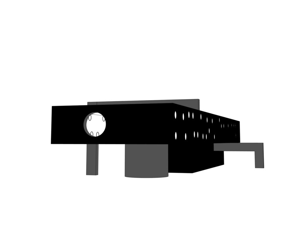
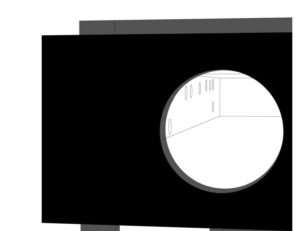
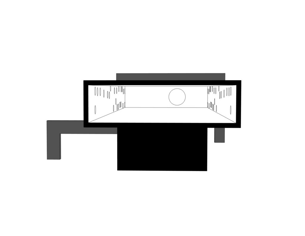
For my diagram my idea is to work around the idea of material collision and the Modernism vs brutalism duality. From the same diagram I also want it to be visible the repetition of shapes and ideas.
With that I am using a black hatch to represent the main block of structure, which makes reference to the brutalism and intense use of concrete. In duality with that, you can see white parts inside that represent the Modernism. I used black and white to show contrast between the two different architectural periods. In grey, I show the repetition of shapes such as the circles and the “arms” coming out of the sides of the building.
GRACE FARMS
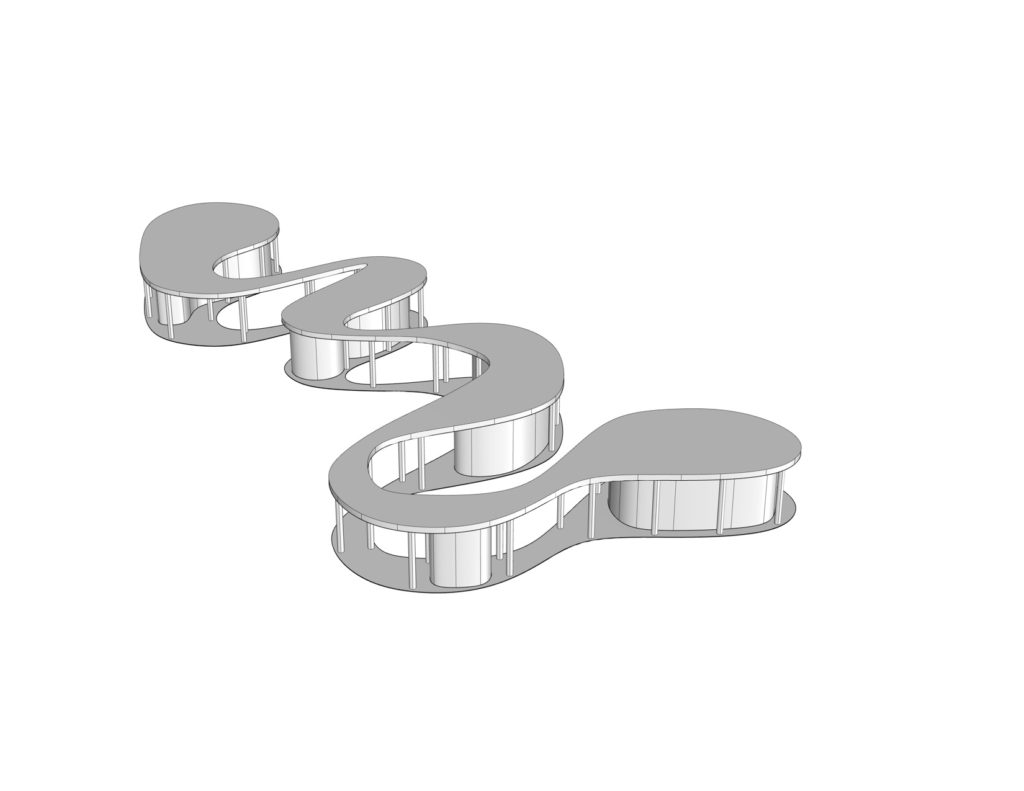
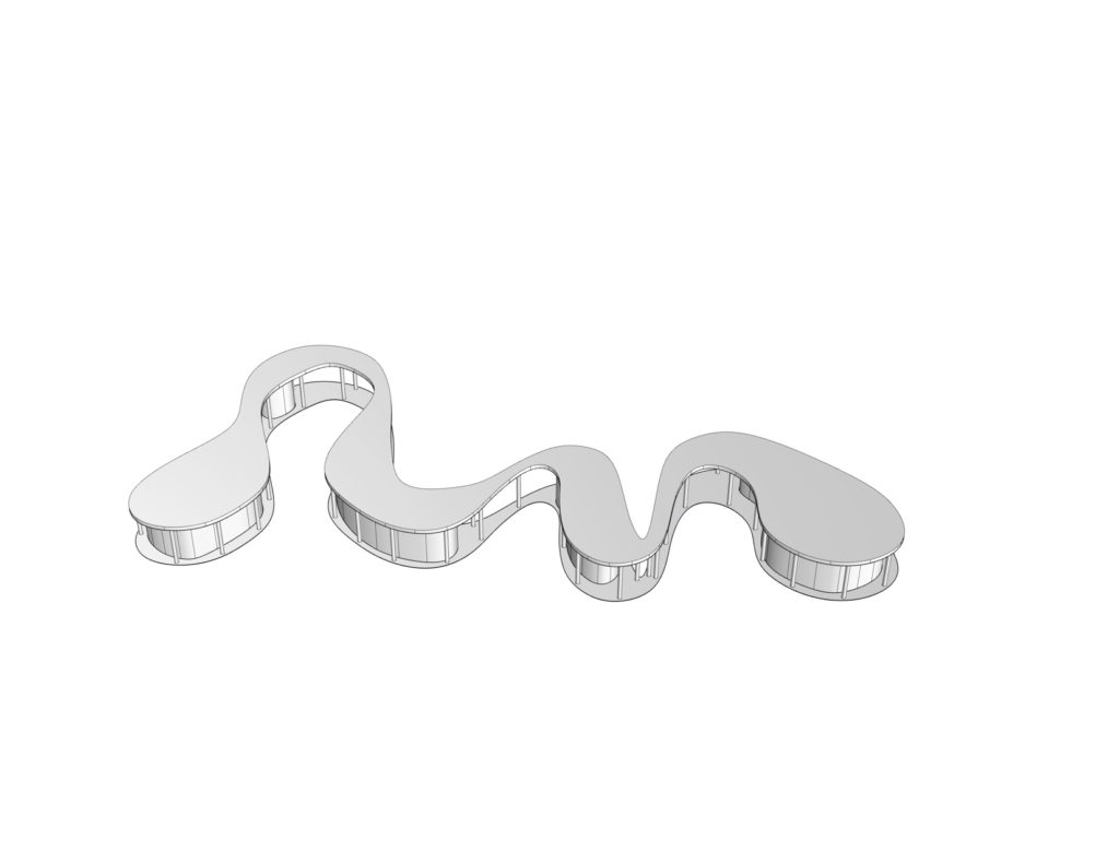
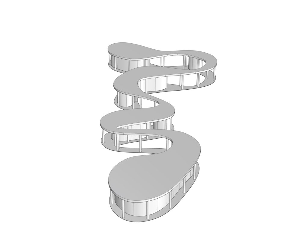
Started modeling Grace Farms. What I find really interesting about this piece is how the closed curves create spaces that aren’t exactly rooms but the feel enclosed because of how the building is distributed. The randomness of the curves and how those are totally different in size and shapes are really interesting and creates an idea that the building and its organic shape blend with the landscape.
TOYO ITO LIBRARY
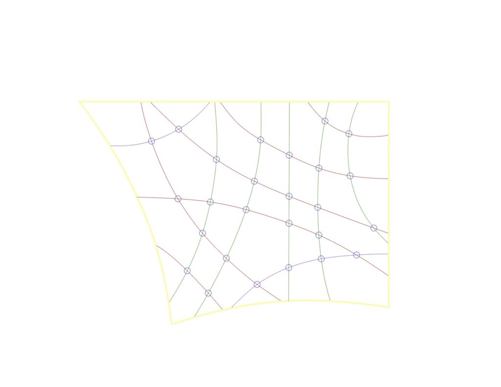
Also started modeling Toyo Ito however I’m still a little confused on what the lines on the floor plans mean. Did some research regarding the lines and the inside walls as we discussed and I believe that the inside columns are meant to be located where the lines intersect. Still need to do some more research and take some more time to understand how the arched windows work. Will keep working on it throughout the week.


